Today, more people browse the internet on mobile devices than on desktop computers. With a variety of screen sizes in use, you need to choose the best image sizes when you build your website, so that all your visitors have a good user experience—no matter their device.
If you don’t optimize your images, your website visitors might see images that are too small and blurry, or too big, increasing load times and forcing unnecessary scrolling and zooming.
The good news is it’s easy to make your images compatible with multiple devices. By choosing the right image dimensions, keeping file sizes minimal, and using a responsive website design, you can provide a top-notch browsing experience.
Follow the tutorial below to optimize your images for mobile and desktop devices.
Best image sizes for websites
Pixel width: 2500 pixels is perfect for stretching full-screen across a browser in most cases. Any image smaller than that might get cut off or appear blurry if it needs to fill the browser width.
Image size: The best overall (pixel) size of your images depends on your use case, e.g., background images need to be bigger than a blog post image.
File size: Anything bigger than 20 megabytes in size can dramatically impact your website speed. Smaller images (up to two megabytes in size, but around 500 kilobytes) are better in most cases.
Image attribute: Image attributes (alt text or alt tag) are text-based and don’t impact your website’s performance. However, they are used to interpret images via screen-reader software and are a key element of web accessibility. Be concise with attribute text—it’s best practice to keep alt text under 100 characters.
Best image dimensions for desktop and mobile devices
The table below provides the recommended dimensions for images on both desktop and mobile websites:
| Website Image Type | Desktop Image Dimensions (W x H) | Mobile Image Dimensions (W x H) | Recommended Aspect Ratio |
|---|---|---|---|
| Background image | 2560 x 1400 pixels | 360 x 640 pixels | 16:9 |
| Hero image | 1280 x 720 pixels | 360 x 200 pixels | 16:9 |
| Website banner | 1200 x 400 pixels | 360 x 120 pixels | 3:1 |
| Blog image | 1200 x 800 pixels | 360 x 240 pixels | 3:2 |
| Logo (rectangle) | 400 x 100 pixels | 160 x 40 pixels | 4:1 |
| Logo (square) | 100 x 100 pixels | 60 x 60 pixels | 1:1 |
| Favicon | 16 x 16 pixels | 16 x 16 pixels | 1:1 |
| Social media icons | 32 x 32 pixels | 48 x 48 pixels | 1:1 |
| Lightbox images (full screen) | 1920 x 1080 pixels | 360 x 640 pixels | 16:9 |
| Thumbnail image | 300 x 300 pixels | 90 x 90 pixels | 1:1 |
These are suggested sizes, which may need to be adjusted based on whether you use a responsive website design.
It’s almost always a good idea for the render size of your images to be smaller than their upload size.
Why is image size important for websites?
For websites, image size is important for three main reasons:
- It creates a better user experience.
- It improves website page speed.
- It helps with website ranking.
Creates a better user experience
Having correctly sized images for every use case on your website helps improve the user experience. Visitors can access an appropriate level of detail, and won’t need to scroll to see the entire image.
When images are low-quality, pixelated, or too small, they can impact the perceived quality of your content. For an ecommerce website, this could lead to customers questioning the quality of your business or products.
Conversely, high-quality, correctly sized images enhance the perceived value of your products and deliver more visual information to potential customers.
For example, see how the images below from sustainable shoe brand Allbirds enhance the user experience by clearly pointing out the various features of their product.
Improves website page speed
When you upload large images to your website, it takes longer for the server to load the page. Smaller images (both in dimensions and file size) tend to load more quickly across devices.
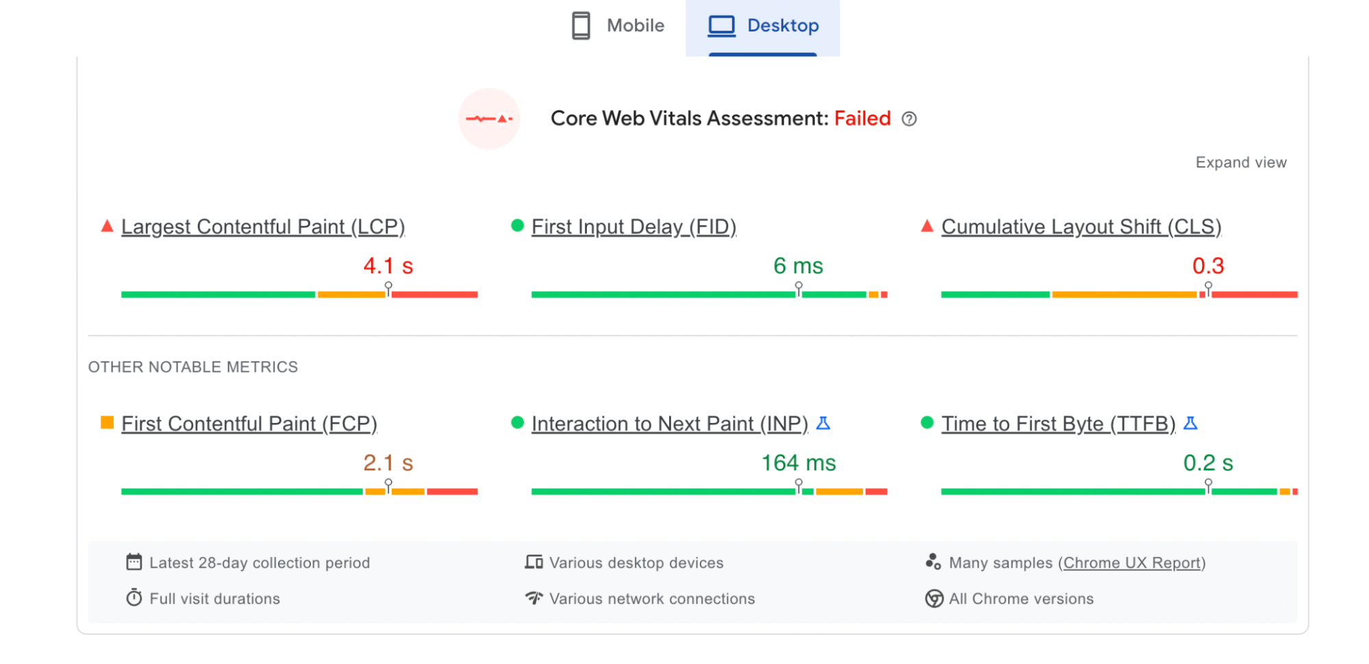
Image loading speed is often referred to as “contentful paint.” You can check your web page’s contentful paint and other page-speed metrics using Google’s PageSpeed Insights.

Half of customers say they’d abandon their shopping cart if a store’s web page take more than three seconds to load. Insights like that show how important it is to optimize your page speeds in order to avoid a high bounce rate.
Helps website ranking
Website ranking refers to the position of your website in search engine result pages (SERPs). Websites optimized for search will rank highly on SERPs for relevant user search queries (known as keywords).
Google uses a host of metrics to determine which web pages rank at the top of their search results. The quality of images (or, more accurately, the improved user experience they generate) is a likely factor in Google’s algorithm.
Website image size guidelines
There are five main types of images you’ll see on a website:
Different size requirements apply to each type of web image. Let’s take a look at the best image sizes for common types of website images.
Background image sizes

Background images are generally the largest images on a website. The image serves as a backdrop to a homepage or other landing page.
For example, bicycle retailer Cowboy lets its product take center stage by using it as a homepage background. It fills the screen, no matter what device it’s viewed on.
Recommended image width: 2560 pixels
Recommended image height: 1400 pixels
Aspect ratio: 16:9
Recommended file size: 20 MB
Hero image sizes

Hero images are similar to background images but tend to be smaller in height—about half the size. A hero image is a great option if you need to feature more text on the screen without making users scroll to see it.
In the example above, BLK & Bold uses a hero image with a narrow aspect ratio to fill the screen yet leave room for content beneath.
Recommended image width: Between 1280 pixels and 2500 pixels
Recommended image height: Between 720 pixels and 900 pixels
Aspect ratio: 16:9
Recommended file size: 10 MB
Banner image sizes
Banner images can be different sizes and shapes, depending on where they live and what you want to show your visitors. The most typical type of website banner is a banner ad. One of the most popular services for promoting banner ads is Google Ads.


If you’re thinking about a banner image that’s not an ad, the rectangular options (e.g., 300 x 200 pixels or 970 x 90 pixels) are generally better.
Recommended image width: Check with the ad platform
Recommended image height: Check with the ad platform
Aspect ratio: Various
Recommended file size: 150 KB (Check with ad platform)
Blog image sizes

Blog images can vary in type and size. The post above comes from sleep experts Kulala, and while the upload size of the featured image is 1200 x 620 pixels, the rendered size is smaller, at 894 x 462 pixels.
Setting a render size for your web pages helps refine your design and keeps files small (the image in the Kulala post is just 95.1 KB).
When it comes to the main header images of your blog posts (those at the top of the page), they should be uniformly sized across your blog.
Recommended image width: 1200 pixels
Recommended image height: 800 pixels
Aspect ratio: 3:2
Recommended file size: 3 MB
Logo sizes

Your logo will likely be one of the smallest images on your website (unless you count the favicon in the tab bar). Depending on your logo design, you should opt for either a rectangular or square aspect ratio.
Most logos lend themselves to a square 1:1 ratio, which you can see in the bottom-left of the Kulala example above.
Rectangular ratios work well for longer brand names or where the logo consists of words rather than a graphic. Shopify’s own website logo uses a longer 4:1 ratio.
Recommended image width: 100 pixels
Recommended image height: 100 pixels
Aspect ratio: 1:1, 2:3, 4:1
Recommended file size: 1 MB
Mobile image size recommendations
Choose the right image dimensions
On smaller mobile screens, many users appreciate being able to zoom in on an image. So, try to strike a balance between image size and file size.
High-resolution images give your website a professional and well-rounded look, with great zoom capabilities. Keep the aspect ratio of similar images the same to maintain a uniform design across page types.
For example, you might make all product images in an ecommerce store square. Square images are easier to reposition on smaller screens. Additionally, square and vertical images fit well on mobile screens, allowing visitors to see more of your images without needing to scroll.
💡 On Shopify, you can upload images of up to 5000 x 5000 pixels with a file size of up to 20 MB.
For square product images, a size of 2048 x 2048 pixels is recommended.
Remember that for zoom functionality to work, your images must be more than 800 x 800 pixels.
Keep file size in mind
Images with larger file sizes can impact your site’s speed, especially when visitors are using a smartphone. Many website-building platforms also have maximum file size constraints on uploads. For example, Shopify uses a maximum file size of 20 MB.
If you need to compress your images to reduce their size, there are online image resizing tools that can help. With these tools, you can reformat large image files into new dimensions or file types.
For the most part, you’ll want header background images below 10 MB, while product photos should be much smaller—around 300 KB.
Resize photos for mobile screen dimensions
Shopify automatically resizes your images to fit smaller screens. But on other platforms, images may require manual editing to make them mobile-ready. Keep in mind desktop and mobile screens have opposite orientations.
Again, remember large files slow down your site’s loading time. While lossless compression can give you the highest quality image, it often creates large files that may take forever for your website to load. Consider using the smallest image files with the best resolution.
While Shopify’s responsive designs and algorithms are good at resizing and displaying your images across devices, giving them a hand with thoughtful file sizing can make for a smoother shopping experience.
What is the best image file type to use?
The right image file type ensures high-quality images, while keeping the file size manageable for better website performance. Here are the most common image file formats and their best use cases:
JPEG
JPEG (or JPG) is one of the most widely used digital image file formats because it offers a balance between file size and image quality. It’s a popular choice for displaying photographs and complex images with many colors.
However, JPEG uses lossy compression, which means some image quality is lost when the image is compressed.
PNG
PNG is a lossless compression format, meaning it reduces file size without sacrificing image quality. It supports transparency, making it a good choice for images that require a transparent background.
While PNGs often have larger file sizes than JPEGs, their ability to retain their clarity makes them suitable for detailed graphics and logos.
SVG
SVG (scalable vector graphic) is a vector image format, meaning it uses mathematical equations to render an image. This allows SVG images to be scaled to any size without quality loss.
SVG is an ideal format for logos, icons, and other graphics that need to be used in multiple locations. SVGs are also typically smaller in file size than other formats, helping to improve load times.
HEIC
HEIC, or high efficiency image format, is a file format used by Apple devices. It uses advanced compression technology to create high-quality images with smaller file sizes than equivalent JPEGs.
However, HEIC is not universally supported on non-Apple devices.
WebP
WebP is an image format developed by Google. It provides lossless compression for images on the web, often reducing file size by more than 30% compared to JPEG or PNG.
This can significantly improve website load times, but it’s worth noting that WebP is not yet universally supported by all browsers.
GIF
GIF is a bitmap image format known for its ability to support simple animations. It uses lossless compression and reduces images to a maximum of 256 colors, resulting in smaller file sizes.
While GIF has largely been replaced by PNG for static images, it remains a popular choice for short, looping animations and is universally recognized by browsers.
TIFF
TIFF, or tagged image file format, is a high-quality, lossless format widely supported by image-editing applications. It’s ideal for storing images for professional printing due to its high resolution and color depth.
With TIFF, multiple images and pages can be conveniently saved in a single file. However, file sizes tend to be large.
How to find out image sizes on a website
The fastest way to look up the size of an image on any web page (without downloading the image) is to use your browser’s Inspect tool.
This method works on Mac and Windows, with Safari, Chrome, or Firefox browsers.
Go to the web page and hover over the image you want information about. Right-click with your mouse to bring up the option menu and look for Inspect:

Clicking on Inspect will bring up the page’s HTML code (it can look intimidating, but don’t worry).
In the inspection panel, information about the image you clicked on should be highlighted. When hovering over the relevant code, the image will also become highlighted:

In this case, the browser tells you how many pixels the image is using. If you resize the webpage, that figure will change accordingly.
If you’re looking for the original upload properties of the image, hover over the image storage link:

To exit the inspector panel, just click the X in the top-right corner.
Image optimization tools
Online image optimizer tools are a simple, fast (and usually free) way to resize your website’s images. Here are three popular image optimization tools:
Image Resizer

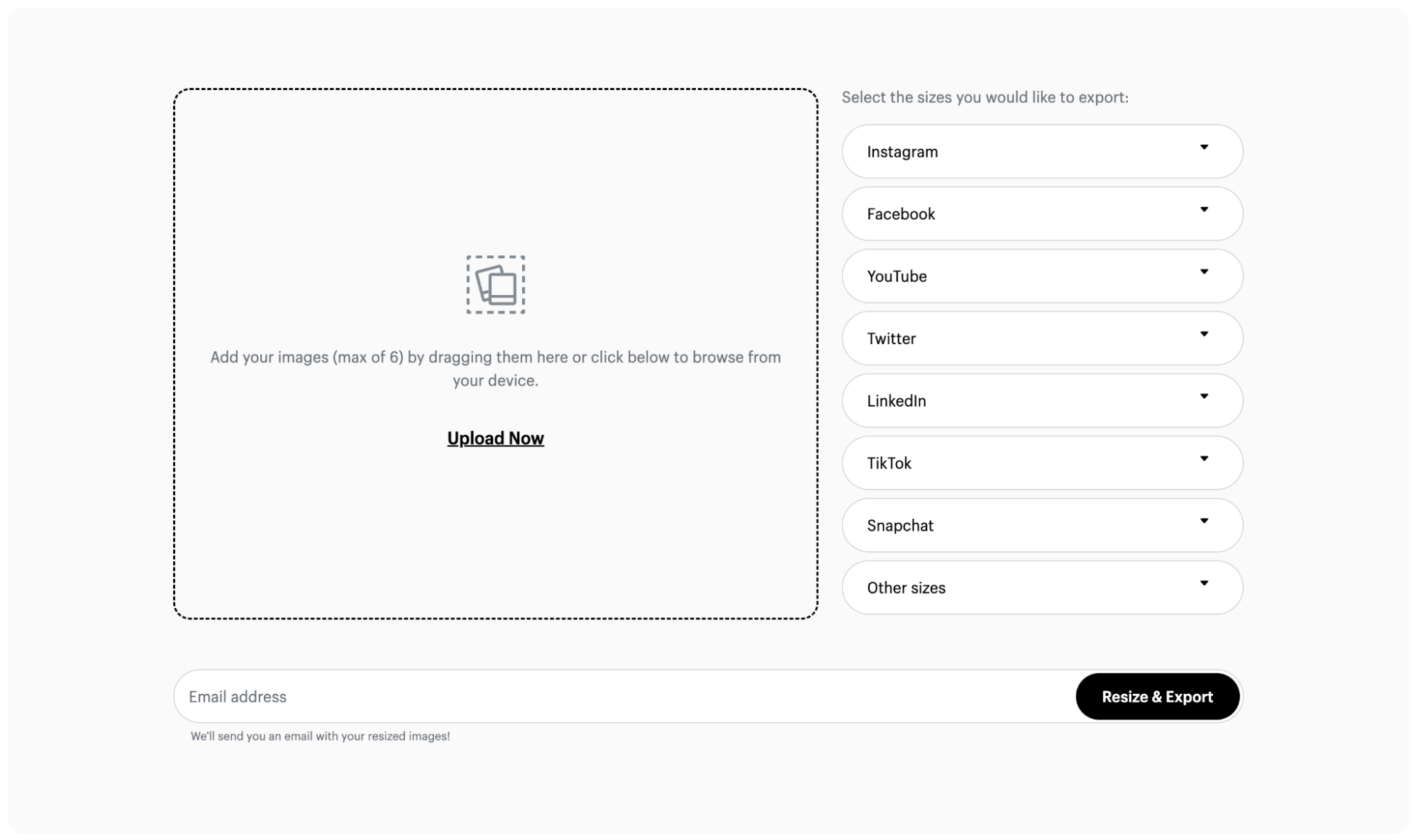
Shopify’s free online image resizing tool is a convenient way to adjust your images for use across marketing channels and social media.
You can choose from a variety of official dimensions for Instagram posts and stories, YouTube thumbnails, and other types of social content.
Image Optimizer by Squirai

Squirai’s image optimizer tool is speed-tested to ensure your images are SEO-ready. It automatically optimizes all the images on your website—including new ones you add later on.
Plus, you can customize and apply a watermark to protect your product photography without needing to know any code.
LoyaltyHarbour Image Optimizer

LoyaltyHarbour Image Optimizer works similarly to the tool by Squirai, automatically compressing images across your website.
In addition, the dashboard allows you to automatically set image alt text and convert to the best image file type for better page speed.
Alternatively, if you have the ability, you can also use Photoshop to help reduce the file size. But this can be a more complicated process than the above tools.
Troubleshooting: image formatting issues
As you manage your website, you’ll probably encounter image formatting issues at some point. Issues with images can range from incorrect sizing to broken links.
Let’s look at solutions to some common problems with website images.
Incorrect image size
Issue: Images appear too large or small, and may break the layout of a webpage, resulting in a compromised user experience.
Fix: If you are using a website theme or template, look for resources on the correct image dimensions for your design. In your website builder, be sure to select render sizes for each image so that images don’t display in their full, original size.
Slow loading times
Issue: Images load more slowly than the rest of a webpage—or not at all.
Fix: The wrong file format can lead to unnecessarily large file sizes that affect loading times. Use an image editing or conversion tool to change the file format of your images. For graphics or logos, consider using SVG for scalability without loss of quality. For other images, consider converting to WebP to compress large files.
Poor image quality
Issue: Images appear pixelated or blurry.
Fix: If your images appear pixelated or blurry, try sourcing a higher-resolution version. Remember, image resolution differs from image size. Resolution refers to the amount of detail an image holds, often measured in pixels per inch (PPI). A higher resolution means a sharper image, regardless of size.
If image quality is being reduced by compression, adjust its compression settings or switch to a lossless compression format like PNG.
Images are not displaying at all
Issue: Broken image links resulting in no image appearing.
Fix: Verify the source URL of your images. This URL should lead directly to the location of your image file. Compare the image file name in the URL with the actual name of your image file. They should match exactly, including the file extension (.jpg, .png, .svg).
Optimize website images for success
Adding images to your website isn’t just about making things look good—it’s a key factor for enhancing user experience and boosting search engine rankings.
The size of your images affects both of these elements. Too large, and your web pages may load slowly. Too small, and your images can appear pixelated or blurry.
Be sure to understand the image dimension requirements of your website design, and pick the right file format to balance image resolution and file size.
From first-time sellers to global retailers, Shopify works for everyone. See plans and pricing.
Best image size for website FAQ
What is the best image size for a website?
Full-screen images should have a minimum width of 2500 pixels. The best image size for a website depends on the image’s use and render size, as well as the effect of image file size on page loading time.
What is the best image format for a website?
WebP is a popular image format for websites to ensure fast performance. Developed by Google, WebP offers lossless compression for images on the web, reducing file size by as much as 30% compared to JPEG and PNG. However, it’s worth noting that WebP is not universally supported by all browsers.
What is the difference between image size and resolution?
Image size refers to the dimensions of an image, usually measured by its width and height in pixels. Image resolution refers to the amount of detail an image holds, often measured in pixels per inch (PPI). A higher resolution means more detail and a sharper image, no matter its size.
How does image size affect website load time?
The larger the file size of an image, the longer it takes for the image to download and display on a user’s screen. This can slow down the loading time of web pages, which can negatively impact user experience and search engine performance. Therefore, it’s important to optimize images by balancing quality and file size.
How can I reduce the file size of images without losing quality?
You can reduce the file size of images without losing quality by using lossless compression, which removes unnecessary data from the image file without affecting the image’s appearance. Tools like Adobe Photoshop or online image optimizers offer options for lossless compression.


